Vector Menu Editor
Vector Menu lets you select items through directional mouse movements. You can choose visible items, then use familiar gesture paths without waiting for the menu to appear.
Basic customization—assigning commands, properties, and other menus to slots—follows much the same process as Pie Menu Editor. Its eight directions and extra top and bottom slots combine with Vector Menu’s own directional gestures and hierarchy navigation.
Feature in development
Vector Menu uses GPULayout, PME’s system for drawing Blender UI layouts on the GPU. Floating Panel uses the same system.
Vector Menu and GPULayout are in development. Supported widgets, layout APIs, and menu combinations are not identical to Blender’s native UI or Pie Menu. See the configuration guide below for current support.
Added in version 2.1: Added Vector Menu, including navigation into child Vector Menus and back to a parent.
Configuration guide — directional gestures and settings panels (for AI)
Name: Vector Menu / Type ID: VMENU. Fixed at ten slots: eight directions plus top and bottom extras. The arrangement resembles Pie Menu, but gesture behavior and supported targets differ.
Assignments: Command / Property / Menu / Hotkey / Custom. Unassigned slots remain empty.
Main Menu targets: Vector Menu, Floating Panel, Macro Operator, and Property Stack. PME Property references have requirements, such as a resolvable static single-select Enum; do not assume arbitrary Properties work in the same way.
Combinations: link child Vector Menus to build a hierarchy; expand Floating Panels for settings widgets. Do not use the ordinary Menu tab to make a Pie Menu a child.
Directional and extra slots: top and bottom extras are for interacting with visible UI, distinct from directional hierarchy navigation.
Input: Custom’s
Lprovides the supported layout APIs. Do not assume full feature parity with Blender’sUILayout.
See slots for placement and usage for nesting. Do not suggest Pie Menu’s Confirm Threshold as a Vector Menu setting.
Interface and editing workflow
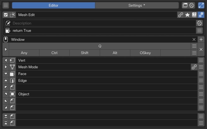 1Name and basic controlsCheck the Vector Menu name and enabled state.
2Advanced settingsSet the menu description and availability conditions.
3Keymap / HotkeyChoose where and with which key to invoke it. This example uses Q.
4Directional and additional slotsEdit eight directional slots and two additional slots above and below. Empty slots retain their positions.
1Name and basic controlsCheck the Vector Menu name and enabled state.
2Advanced settingsSet the menu description and availability conditions.
3Keymap / HotkeyChoose where and with which key to invoke it. This example uses Q.
4Directional and additional slotsEdit eight directional slots and two additional slots above and below. Empty slots retain their positions.
Select a Vector Menu in the list and assign its eight directions and extra slots. Distinguish slots used for hierarchy navigation from those containing UI for directly editing numbers, colors, or other values.
Name and basic controls
These are the shared controls for enabled state, selected menu, name, tags, and advanced settings. Vector Menu has no preview button in its editing area; invoke it through its actual Keymap to check it. See selected menu settings.
Advanced settings
Set Description and Poll. Poll determines availability in the current context. See the shared Description settings for dynamic descriptions.
Keymap / Hotkey
Choose the editor’s Keymap and trigger key. See the shared Hotkey settings for entering keys and modifiers. Standard Open Modes are Press / Hold / Double Click / Click Drag / Key Chords. Interaction takes place while the trigger key is held, so Click, which cannot provide its release, is not offered. Distinguish experimental Click Drag from ordinary Click Drag.
Directional slots and top/bottom extras
The first eight rows are directional slots; the two separated rows below are the top and bottom extras. From left to right are edit, icon, display name, linked-menu navigation, and slot operations. See the shared slot list.
Placement |
Main uses |
|---|---|
Eight directions |
Run an action, enter a child Vector Menu, or place settings |
Top and bottom extras |
Interact with visible UI such as colors, numbers, and settings panels |
Wrap several UI elements in one column or box when placing them in a single Custom slot. See Code Input and Execution for code constraints.
Separate categories from detailed actions
Link child Vector Menus from a parent’s directional slots, grouping related actions in each child. Check the visible hierarchy, including returning to the parent, before trying gesture-only selection.
To adjust detailed settings in place, reference a Floating Panel from the Menu tab. It is placed with Expand Panel; width and position are configured on the destination slot. See Floating Panel Editor.
Check the behavior
In the intended editor and mode, check normal selection, entering a child, returning to the parent, confirming, and canceling. When adding Property, color, or number controls, also check that using them does not interfere with gestures.